I’m a big fan of Glossier – their brand, look and feel of their website and product photography, it’s all sharp and super on-point.
However, what I particularly like is how they proactively showcase their products across a mix of complexions and races. They’re an inclusive brand. Big fan.
For those of you reading this who aren’t aware of what Glossier do; they’re a cool beauty and skincare brand founded by Emily Weiss. An interesting fact? The $multi-million brand actually started as a blog in 2014 before it eventually grew into the ecommerce staple that it is today.
However, as much as I love Glossier, for me it feels as if there’s some seriously untapped opportunities when it comes to their SEO and user experience – that’s precisely what this post brings to light.
Let’s start with SEO. The skincare giant does not lack in the authority department. With seemingly endless links from sites like Huffington Post, Yahoo, Refinery29 and other authoritative websites; they’ve real equity to leverage here.
Additionally, according to ahrefs and at the time of writing, Glossier.com has an ahrefs rank of 13,970; that’s hugely impressive. This means it’s one of the most powerful websites that ahrefs has in its inconceivably huge database which consists of 100s of millions of domains.
To put this score into perspective, Linkedin (believe it or not) scores lower with a rank of 13,981 at the time of writing. That’s huge for Glossier.
Glossier could really win big traffic by simply optimising their categories
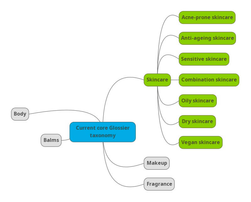
First take a look at Glossier’s core taxonomy structure. Their categories are all on one level – there are no subcategories. This directly limits how well they can rank for more specific (and higher converting) organic search queries.
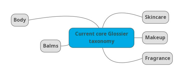
As you can see it’s flat and lacks real depth. This will have a profound impact on SEO potential but will also limit conversion performance and user experience too. Customers can’t ‘dig deeper’ to find the specific skincare, makeup or fragrance that they may be looking for.
Let’s drill into their skincare category as an example
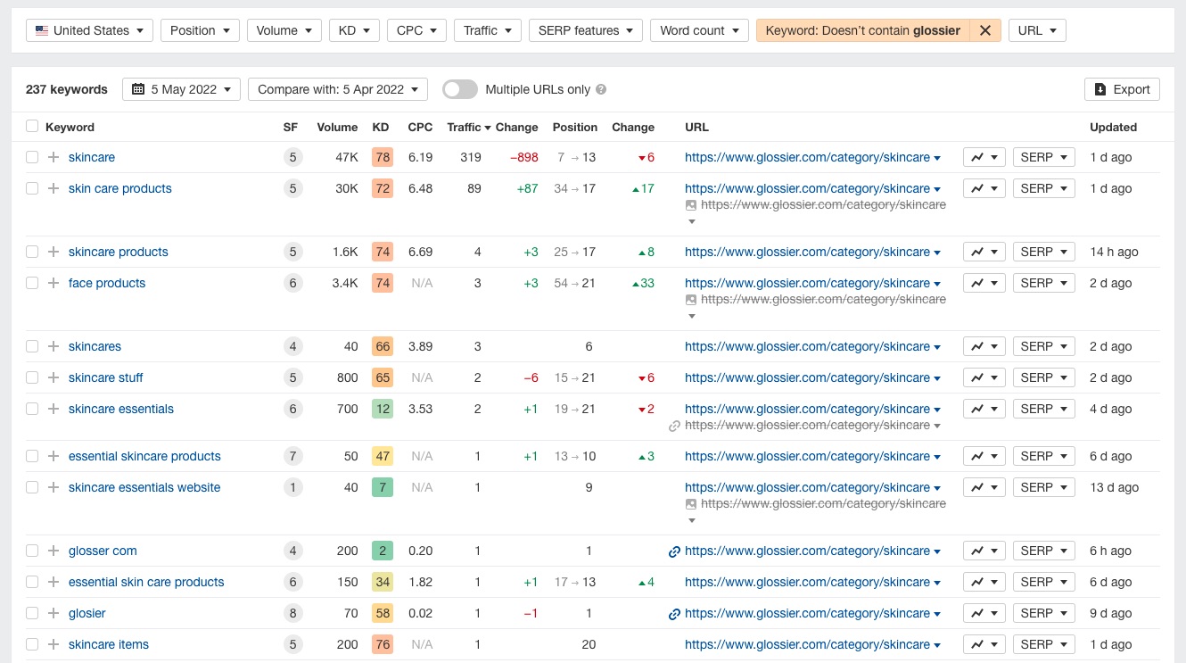
If we take a look at the current organic keywords (minus branded terms) their skincare category gets, we can see it lacks real keyword diversity.
Quite literally proof that links and authority alone won’t help you rank for desirable keywords.
Unsurprisingly, the skincare category only ranks for keywords that are closely matched to the keyword ‘skincare’.
Additionally, the rankings for these keywords aren’t great with only a handful of them getting visibility on page 1.
More importantly though, skincare is a pretty ambiguous keyword. Sure, there’s lots of volume, but the intent is unclear and there’s less chance that the people searching for just skincare are looking to make a purchase.
There are no keywords appearing here for say different types of skincare or sub-topic/descriptive forms of skincare that could boost their traffic to this category.
This is where Glossier could really and quite literally clean up just by optimising their category structure. Let’s look at how.
Surfacing new keyword opportunities for Glossier’s skincare category
To discover new keyword opportunities, I really like to use semrush’s keyword magic tool or the matching tools report in ahrefs.
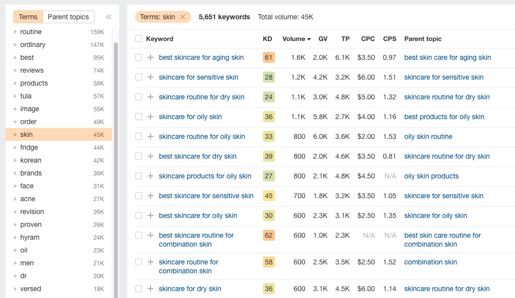
Just from throwing the keyword ‘skincare’ into ahrefs and then diving into one of the groupings to the left, in this case, ‘skin’, we have already surfaced some interesting opportunities with heathy search volume including:
- Skincare for sensitive skin
- Skincare for ageing skin
- Skincare for dry skin
- Skincare for oily skin
- Skincare for combination skin
- Skincare for acne prone skin
These keywords alone would dramatically improve the overall keyword diversity of their skincare parent category.
Additionally, these keywords are more specific and have stronger purchase intent. Both of these qualities make long tail queries much more likely to convert compared to ‘skincare’.
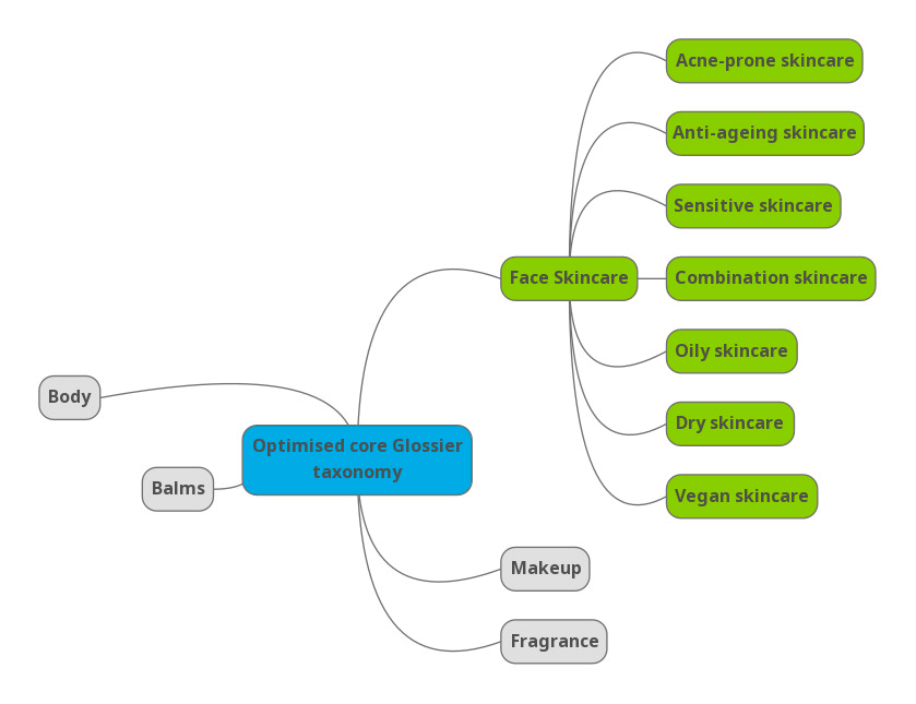
Taking these new keywords into account, let’s take a look at how Glossier’s multi-level taxonomy could begin to take shape (changes in green):
By adding in these additional and concern-specific subcategories, not only can Glossier target new and more specific purchase-intent keywords, they make it much easier for customers to find the skincare products they’re looking for improving ‘findability’ and thus conversion.
Just imagine the potential Glossier can unlock here by applying these optimisations to all of their core parent categories.
The number of new, highly relevant organic keywords that would be within reach by making these changes would likely transform their organic presence and grow sales via organic too.
There are some limits and rules to play within though…
Now, before we get carried away – there are some points mentioning about these suggested optimisations.
Not all of these subcategories will be applicable
For example, it’s possible that Glossier doesn’t make a product(s) specifically for acne-prone skin right? If that’s the case, the category just shouldn’t exist.
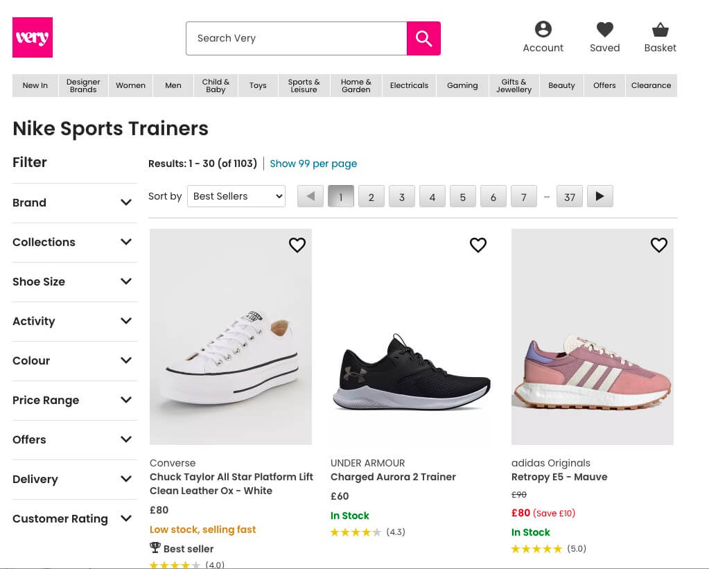
Yes, this might sound obvious, but I have seen it happen before where categories exist for SEO benefit and they’ve been populated with products that don’t really fit the bill or address the premise of the category itself. This may be an isolated case, but here’s a great example over on Very of a subcategory gone wrong:
There is such a thing as too many subcategories, it’s about finding the right balance
Having too many subcategories can make it more difficult to successfully manage and merchandise products within them correctly.
Additionally, too many can add complexity to the shopping journey costing sales. You also run the risk of cannibalising other categories if you’ve two similar subcategories within different parent categories.
It’s all about finding the balance where you’re optimising the customer journey and SEO and not adding too many categories to impact these areas negatively; taking into to account the number of SKUs you’re handling.
It’s common (and good) practice to have one product in more than one category
Using the skincare example above, let’s say that Glossier has a skincare product that’s great for both oily and combination skin. This item could therefore exist in both of those respective subcategories in addition to the parent Skincare category too.
Here’s a great example of category optimisation done well
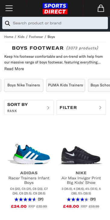
Love or hate Sports Direct, they’re killing it when it comes to optimising their categories from an SEO and UX perspective.
Take a closer look at the well-researched subcategories that exist within this Boys footwear category. A mix of brand and product-type categories within the ‘Boys Footwear’ category really helps Sports Direct to reach so many more ‘ready to buy’ customers via organic search.
They can target so many more permutations of keywords around boy’s footwear including:
- Boys school shoes
- Boys [popular brand name] trainers etc
Just one more suggestion on the topic of categories
If there’s one thing that Glossier take from this advice, it’s to consider renaming their ‘Skincare’ category and for a very good reason.
As we’ve mentioned, the term skincare is pretty generic and ambiguous in the context of a keyword for search.
More importantly, the Skincare category on Glossier is full of products for the face and additionally, they’ve a dedicated category for body. As a result, the skincare category isn’t descriptive enough.
My suggestion here is that the category is renamed to ‘Face skincare’. In doing so, the category is more specific and it helps the brand to begin to target face oriented skincare queries; which is exactly what this category contains.
Some final observations to boost conversion
Lastly, some additional observations I’ve made which at present are likely to be negatively impacting how well their website converts – especially for first-time Glossier customers.
Add filters to category pages
To help people find the products they’re looking for, it makes perfect sense to enable (even a basic set) of filters onto the product listing pages.
Allowing people to filter down to vegan lines, identify products that focus on a core problem area etc are all helpful ways to make the shopping journey easier for potential customers.
It’s surprising that Glossier doesn’t have this feature so it’s possible there’s developments around this area or a solid business-specific case as to why it doesn’t exist.
On the topic of filters, one specific option that’s having great success for a client of mine is displaying a ‘travel size’ filter option. This allowing visitors to ring fence lines that can be packed into hand luggage when travelling by air.
Maybe chill out on all the popups
Glossier have a lot of intrusive popups and these are likely to be having a profound negative impact on conversion.
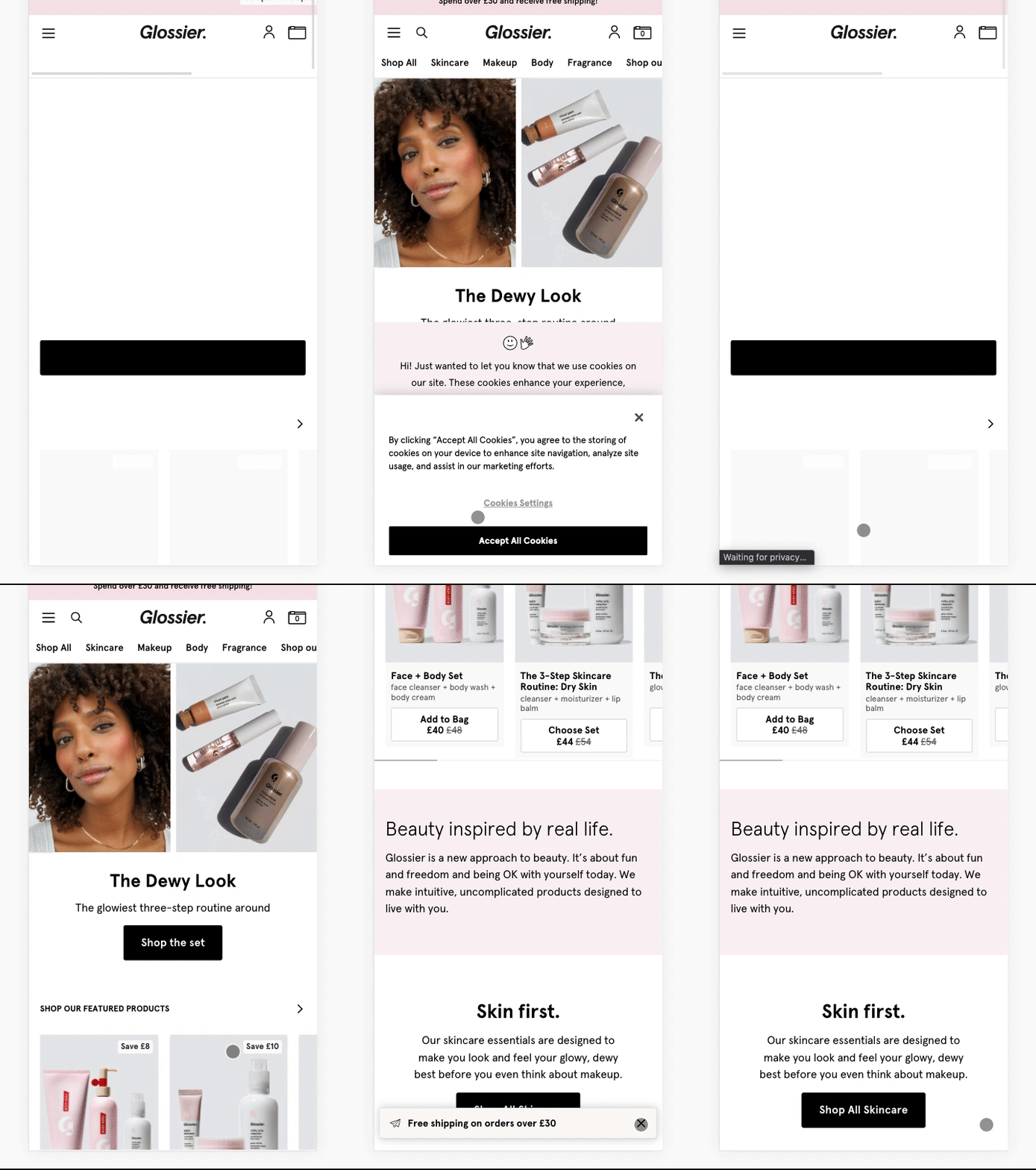
After testing this for clients and with my own ecommerce projects, intrusive popups often directly have a negative impact on conversion. I’ve no doubt a similar trend can be found over on Glossier.
Just take a look at this GIF below to see just have aggressive these popups can be for visitors.
Closing thoughts
Glossier are going to be just fine without making these optimisations to their user experienc/website. However, they’ll almost certainly do better at driving sales online if they do.
Whether you’re reading this as someone who works at a digital/SEO agency, you’re in-house or even Glossier(!) and this has inspired you to optimise your ecommerce store, then my job is done. 😃
Although this post is heavily focussed around Glossier’s opportunities, there are so many brands and retailers online that make these same mistakes; leaving huge amounts of organic traffic and ready-to-buy traffic on the table.
Optimise your categories, improve your UX and grow your sales!
