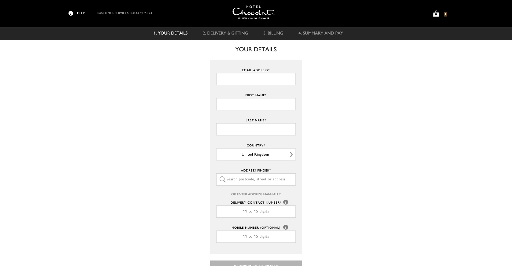
Ahh yes, Hotel Chcolat – the ‘go to’ mega posh chocolate brand who appear to be doing a great job of wiping out Thorntons (when was the last time you saw one of their stores on the high street?) Also, their salted caramel chocolates are unreal.
Anyway, I digress. Hotel Chocolat; delicious confectionary with a bitter-tasting checkout experience. In fact, I covered Hotel Chocolat’s checkout experience (in video form) in a previous Let’s Talk Shop tutorial where I surfaced all the areas where their fractious checkout is almost certainly costing them customers and sales.
If you’re interested in subscribing to my free ecommerce SEO and CRO tips newsletter, you can sign up here
Bearing in mind that Hotel Chocolat’s demographic is ABC1 with an catchment age of 30-60, their words not mine – (page 41), you could argue that the upper-end of the age bracket they’re targeting isn’t always akin to being technophiles.
Having worked with a more mature ecommerce demographic across a number of clients; it almost always pays dividends to simplify experiences and checkouts when working with customers who’re potentially less confident online.
With that in mind, here are the five things I’d optimise to boost conversion on the Hotel Chocolat website.
1) Prevent the loss of data when you navigate away from the checkout
This is a particularly frustrating quirk that surprisingly isn’t unique to Hotel Chocolat. I’ve definitely seen this antagonising issue elsewhere too which only becomes more frustrating as the amount of data you’re losing increases.
Specifically completing a checkout form only to lose everything you’ve entered if you leave and return to the checkout flow.
For context, many customers will get to the checkout stage and step out of it to continue shopping – it’s actually quite common behaviour.
In fact it’s more common for customers to go through multiple checkout steps more than once during their session when making a purchase.
Now, when it comes to the Hotel Chocolat checkout, if you complete the fields at the first step of the checkout, proceed and then at any point leave the checkout, all of your data entry is lost if you’re checking out as a guest.
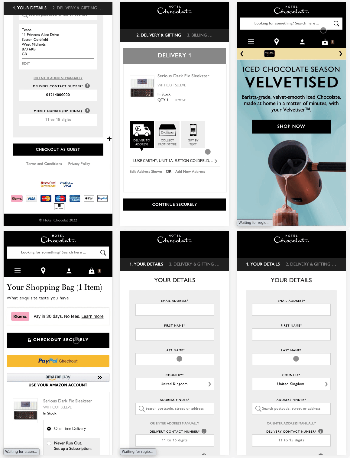
This means if you want to continue with your purchase (assuming losing your data entry hasn’t caused you to rage quit) you’re going to need to re-enter your information again.
ℹ️ Note: Interestingly, should you wish to specify a separate billing address, you’re only able to do so several checkout steps later which is unusual and potentially quite confusing. Additionally, when you’re entering a billing address, it has to be done so manually as there’s no address lookup functionality!
Surely that’s not such a big deal with auto-complete?
To a point, yes but Hotel Chocolat have another issue plaguing them here.
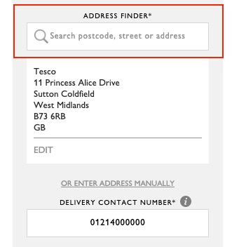
Using autocomplete to fill out step 1 of the checkout can cause the form validation to fail. The problem here is that the browser’s auto-complete does not always play particularly nicely with address lookup fields.
Sure, the browser will throw in the customers’ post code, but what it won’t do is complete the address lookup step (as this field senses keystrokes).
So, by failing to trigger address search, the ‘checkout as guest’ CTA remains frustratingly greyed out with no explanation as to why no matter how many times you click it!
Bringing me nicely onto my next point…
2) Stop greying out key checkout CTA buttons when validation fails
As a customer, I’m trying to buy something from you, not play detective and attempt to understand why I can’t progress through the checkout steps.
One of the most frustrating validation techniques in ecommerce is seeing that theres an issue but instead of helping the customer understand where they’ve gone wrong, the website is designed to just disable the CTA button. This is anything but helpful and borderline offensive considering they want to purchase goods/services from you.
This is exactly what can happen with Hotel Chocolat’s checkout. Sure, it’s pretty edge case, but the whole ethos around conversion optimisation is to make numerous positive changes which then collectively leads to incremental conversion growth.
Back to the issue at hand, this particular validation issue is particularly prevalent when you’re using the auto-complete feature offered by your browser.
All of the fields appear to be completed successfully but the CTA to proceed to the next step is greyed out and disabled. Clicking it achieves nothing.
Instead, a better and more helpful experience would be to ensure the CTA is permanently enabled. This means that when customers click it, validation is triggered and the fields with the errors can be highlighted with a note as to what needs to be fixed.
3) Is this the billing or delivery address? It needs to be much clearer
Further critiquing the first step of the checkout form, it’s unclear whether the address that Hotel Chocolat require is for the billing address or delivery address.
It’s a super-small change to clear that up, but doing so prevents customers having to go back and forth through the checkout steps to correct it should they make the wrong assumption.
For clarity, it’s the delivery address that this field relates to as confirmed by the next checkout step.
4) Improve the mobile checkout page to make it more legible and easier to use
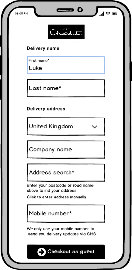
I’ve made a handful of small improvements with a quick mockup, which now makes the first step of the checkout clearer and easier to use. Here are some of the changes made:
- Leveraging bigger fonts and removing all caps from the fields to make them instantly easier to read
- Breaking out fields into sections to give a greater sense of space / less clutter
- Clearer mandatory field markers
- Making it clear that the name and address is specific to the delivery (and not billing)
- CTA button is permanently enabled to allow user to trigger validation checks at any stage
- Bigger font used on CTA
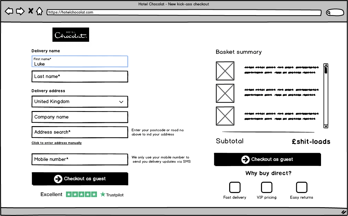
5) Create a checkout design that’s also accommodating for desktop customers
I’ve also created a mockup of an optimised checkout experience for their desktop audience too. By making use of the additional space and including more trust signals to reduce abandonment and increase buyer confidence, we’ve ended up with a sharper checkout experience for step 1.
Conversion rates are often higher on desktop than they are on mobile; with desktop users also spending more time on site compared to mobile users too.
Additionally, average order value is often higher for desktop users. With such a narrow, single column and lazy design for desktop users; Hotel Chocolat are failing to maximise the extra real estate to provide bigger-screened users with the best experience and display conversion boosting elements.
In summary
As you can see, there are a number of sizeable (and quite frankly inexcusable) gaps that are currently making it more challenging that it really should be for customers to purchase.
For such a luxury oriented brand, Hotel Chocolat customers will be expecting much more from its D2C website. The current checkout is strangely disconnected from other parts of the site and doesn’t particularly align with their designer/premium brand identity. As a result, the checkout feels sparse, clunky and lazily put together; A bolt on solution rather than one that’s well thought out and considerate to its audience.
In cases like this, there’s almost certainly a tech gap or resistance to change within the organisation.
However, as Hotel Chocolat’s is a profit-oriented business that’s aiming to command more market share and drive more in ecommerce sales, it seems hugely counter intuitive to avoid such transformations that proactively optimise conversion across all digital channels and deliver that sweet online growth.
It’s about time Hotel Chocolat made their checkout as tasty as their chocolate!
